The Ultimate Squarespace Banner Size Guide (+ Infographic)
So you’ve got a Squarespace website and want to add some eye-catching banners. Great idea!
But before you dive headfirst into designing your banners, you need to know the suitable sizes and the right Squarespace design tips. Using the wrong file size and dimension can make your beautiful banner distorted, pixelated, or not appear at all — no one wants that.
This guide will walk you through the ideal banner sizes for every Squarespace page section so you can confidently create stunning banners. Let’s get started!
Top tip: what’s the point in having an eye-catching banner if no one sees it? Optimize your site’s SEO so you can attract visitors to your properly sized Squarespace banner - checkout our SEO plugin to learn how.
Short Summary
Squarespace has specific guidelines for banner dimensions to ensure they display correctly across devices.
The most popular banner sizes include Mega View (2500 x 1500 pixels), Large Rectangle (1500 x 500 pixels), Medium Rectangle (750 x 250 pixels), and Wide Skyscraper (150 x 500 pixels).
Customize your banner size with custom CSS for complete control and to match your specific website needs.
What are the Standard Squarespace Banner Sizes?
If you own a Squarespace website, you’ll want to make sure any banners you use are appropriately sized. Squarespace has specific requirements for banner dimensions to ensure they display correctly across devices.
Squarespace supports several standard banner sizes but doesn’t exceed 2500px in width. To see the full breakdown, checkout the below infographic 👇
The most popular Squarespace banner sizes are as follows:
2500 x 1500 pixels (Mega View): This horizontal banner size is ideal for displaying at the top of your page. It works well on both desktop and mobile devices.
1500 x 500 pixels (Large Rectangle): This smaller horizontal banner is ideal for mobile devices or placement within content. It has a minimal impact on the user experience.
750 x 250 pixels (Medium Rectangle): This versatile size can be used in multiple locations, like the sidebar, content pages, or article pages. It’s easily viewed on all devices.
150 x 500 pixels (Wide Skyscraper): This size is a good option for vertical ad placement. It fits nicely in the sidebar and is best suited for desktop viewing.
To ensure your banners are appropriately sized in Squarespace, it’s crucial to enter the exact pixel dimensions when creating the images for upload. Don’t worry if your banner looks small on the upload screen — Squarespace will automatically scale it to the proper size when displayed on your site. Also, a key point in our Squarespace SEO checklist is to ensure your banner file size doesn’t exceed 500 KB to avoid a slow-loading website.
How to Customize Your Squarespace Banner Size Using Custom CSS
You must customize your Squarespace images if you want complete control. By default, Squarespace gives you a few preset banner size options, but what if you want something different? The good news is that you can easily adjust your own Squarespace image sizes with some custom CSS.
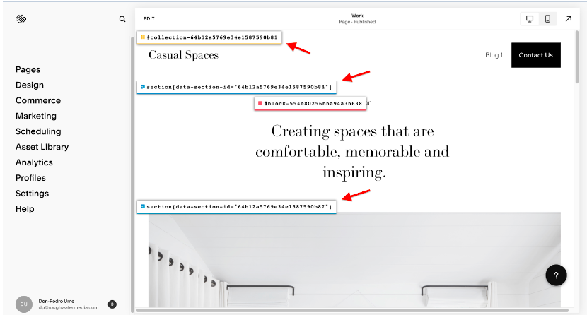
First, get the Collection ID of the actual image file you want to customize. You can do this by using Squarespace ID Finder. Click on the extension icon to activate it while editing your website. Afterward, you’ll notice your website content’s ID, as shown below.
Note down the value as precisely as they’re displayed.
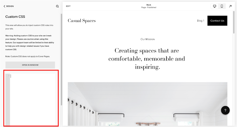
Next, navigate to “Design” >>> “Custom CSS.” Here you’ll add the custom code to adjust your banner size.
You’ll want to use something like this:
COLLECTION ID {
height: your-height-in-px;
}
So, for example, if you want a banner that’s 600px high, use this code:
COLLECTION ID {
height: 600px;
}
This will make the image block your banner 600px high while keeping the original aspect ratio.
You can also adjust the image width if needed using the following code:
COLLECTION ID {
width: your-width-in-px;
}
Be sure to adjust the Squarespace image size width and height properties together to avoid distortion.
To center your banner content vertically and horizontally within the new size, add the following code:
COLLECTION ID {
height: 100%;
display: flex;
align-items: center;
justify-content: center;
}
This uses Flexbox to center your banner content perfectly.
With simple CSS adjustments, you can control your Squarespace background image size and make it whatever dimensions you need. Customize away!
Choosing the Right Squarespace Banner Size for Your Website
Choosing the right banner size for your Squarespace website depends on where and how you want to use the Squarespace banner image.
The common banner sizes Squarespace offers are as follows:
Mega View (2500 x 1500 pixels)
The mega view banner size is as large as you can get for maximum visibility. It’s ideal for hero images, splash pages, or when you want to make a bold statement. However, due to its immense size, the mega view banner is best used judiciously and primarily on desktop viewports. On mobile, Squarespace will scale it down to fit the screen.
Large Rectangle (1500 x 500 pixels)
This long, horizontal image size is ideal for stretching across the top of your page. It’s a popular choice for navigation menus, slideshows, or eye-catching headlines. The 1500 x 500 size works well on both desktop and mobile devices.
Medium Rectangle (750 x 250 pixels)
The medium rectangle size is an excellent choice for featured images, spotlights, or call-to-action buttons. This style also adapts well to mobile devices, so your message will be seen regardless of how visitors access your site.
Wide Skyscraper (150 x 500 pixels)
The half-page size commands attention if you want a banner that dominates the page. It works for promoting special offers, highlighting portfolios, or sharing impactful stories. However, this size may be too large for some mobile devices, so Squarespace will automatically resize it to fit.
***
Ultimately, you need to determine how prominently you want your banner to display on your site and the types of content or message you need to convey. By experimenting with Squarespace’s banner sizes and exploring different Squarespace websites with great design, you can choose what suits your website needs and then customize the design for maximum impact.
Remember that Squarespace will automatically resize the banners for optimal viewing on every device, so you can focus on creating visuals that inspire and inform your visitors.
8 Tips for Designing Effective Squarespace Banners
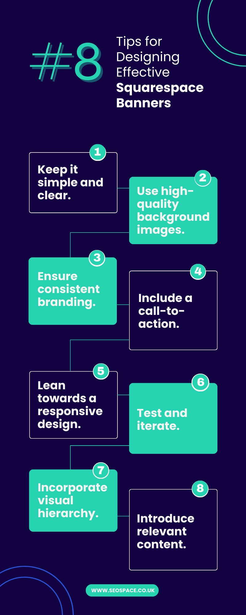
Now that you know the recommended Squarespace banner sizes, it’s time to design banners that genuinely stand out - check out the below infographic for the summary 👇
Here are some design tips to help you create compelling and visually appealing banners for your Squarespace website:
1. Keep it simple and clear.
Banners should deliver a clear message at a glance. Avoid cluttering your design with too much text or visual elements. Opt for a clean and minimalistic approach that highlights your key message.
2. Use high-quality background images.
Ensure your banner images are high-resolution and optimized for web display using web-friendly image file types like JPEG. This will help maintain the visual quality and avoid pixelation. We recommend using an image resolution of 2,500 pixels wide for optimal image quality. See this image optimization guide for more info.
3. Ensure consistent branding.
Maintain consistency with your website’s overall branding in color scheme, fonts, and style. This will create a cohesive look and feel that reinforces your brand identity.
4. Include a call-to-action.
Incorporate a clear and convincing call-to-action (CTA) in your banner design. Be it to encourage visitors to explore further, sign up for a newsletter, or make a purchase, a well-placed CTA can boost engagement and conversions.
5. Lean towards a responsive design.
Remember that your banners will be viewed on various devices, including desktops, tablets, and mobile phones. Test your banners across different screen sizes to ensure they display correctly and maintain their impact.
6. Test and iterate.
Don’t be afraid to experiment with different banner designs and messages. A/B testing can help you identify the most effective banners that resonate with your audience. Keep track of the performance metrics to refine and optimize your banners over time.
7. Incorporate visual hierarchy.
Use design elements like size, color, transparent background, and positioning to create a visual hierarchy within your banners. This will guide the viewer’s attention and emphasize the most essential information.
8. Introduce relevant content.
Tailor your banners to the specific page or section they appear in. For example, if it’s a blog banner, consider featuring an enticing image related to the blog site title or post topic. This will create a cohesive and engaging user experience.
Top Tip: You can change your Squarespace site title in 5 simple steps to further customize your website.
***
Remember, your Squarespace banners help you engage your visitors. Besides that, if you are a web designer, mastering Squarespace banners can help you get more web design clients looking for captivating banners.
By following these tips and experimenting with different designs, you can create compelling banners that leave a lasting impression. Here are some other Squarespace SEO tips to help your website stand out in search results. Happy designing!
Frequently Asked Questions
What is the best Squarespace banner size?
The best Squarespace banner size is an image that’s 2,500 pixels wide. Squarespace will automatically resize your image to fit the banner area of your template. Using a larger image will ensure it still looks sharp when resized.
How do I change the size of my banner image in Squarespace?
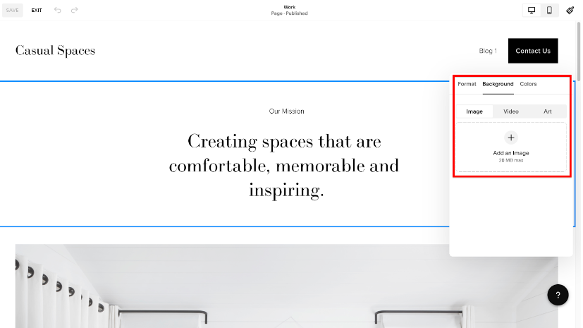
To change your banner background image size in Squarespace, simply replace the old image with a new one that has the recommended size. The process differs depending on whether you’re on Squarespace version 7.0 or 7.1.
To do this in Squarespace version 7.1, head to the page under “Pages,” select “EDIT,” navigate to the section of interest, select “EDIT SECTION,” and navigate to “Background.” Afterward, click the “plus sign” to add the image with the recommended size.
In Squarespace version 7.0, you can either add a page banner, site-wide banner, and collection item banner by navigating to “Pages” >>> “Media” >>> “Add Image.”
Alternatively, you can tweak your Squarespace banner size using custom CSS.
Squarespace Banner Size Conclusion
Squarespace banners offer a great way to add flair and draw attention to your website. Squarespace banner sizes. This guide has outlined how to design stunning banners that catch attention and drive clicks. Whether you want a large header to make a bold statement or a small sidebar ad for your services, you now know precisely which size options will work and how to implement them.
The next time you log in to your Squarespace site, put these banner dimensions and tips to good use — your site visitors will appreciate the changes. Don’t forget to request a free website SEO audit from us. Here’s an equally free Yoast for Squarespace to help you get the most out of your website.


